
My living room had nice furniture and decent lighting but it still felt like a waiting room. Took me embarrassingly long to figure out it was missing texture. Every surface was smooth, every color was flat, and nothing invited you to actually sit down. That same slow-click moment happened when I tackled my cabin exterior. A few changes made it stop looking like a rental and start feeling like a place people actually want to linger outside.
These ideas lean rustic, earthy, and a little modern. Most tweaks are under $150, with a couple splurges if you want long-term durability. They work for cabins, cottages, and mountain condos, and they focus on siding, entry, porch, and the first five feet of landscaping.
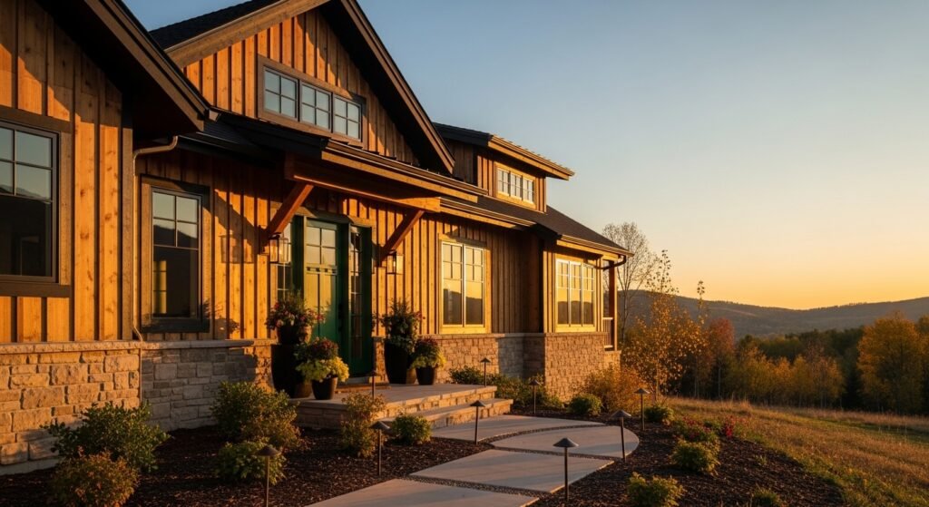
Warm Wood Siding with Matte Black Trim for Cozy Curb Appeal
The moment I stained our siding a warm honey tone, the house stopped disappearing into the trees. Wood siding reads as intentional warmth, and matte black trim frames windows so they read like pictures. For balance, aim to keep wood on roughly two thirds of the facade and use black trim on one third. I used semi-transparent cedar stain for color depth and applied with a 4-inch brush around windows for clean edges. Common mistake is over-darkening the trim, which eats visual weight. Measure the window apron and paint two inches of trim inward for a crisp, pro look that photos actually capture. Pair this with the stone entry idea below for grounded contrast.
Stone Accent Around the Entry for Rustic Grounding
We added a one-foot-high stacked stone base along the porch and suddenly the house felt anchored. Stone should cover the lower third of the facade where it meets landscape. I recommend a ledgestone in warm taupe so it reads as part of the earth. For DIY, use a single-row stone veneer and keep grout joints thin, about 1/8 inch, to avoid a chunky, faux look. I ordered stacked-stone veneer panels and rented a wet saw for an afternoon. The mistake people make is carrying stone too high. If you go higher than waist height, the house can look heavy. This idea plays beautifully with layered planters and low-profile lighting from other sections.
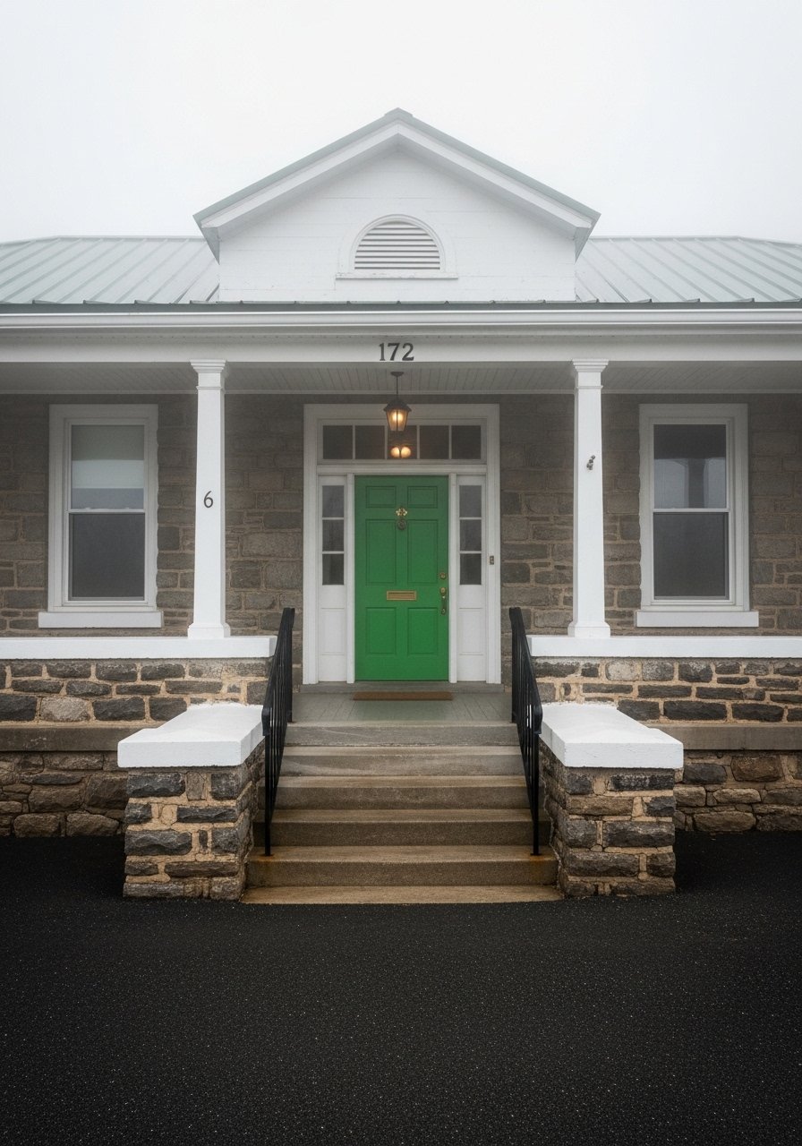
Deep Forest Green Door for Intentional Contrast
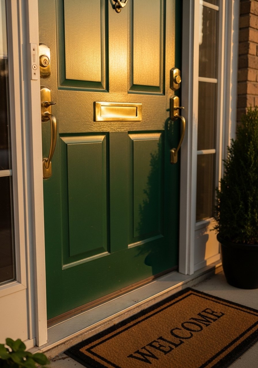
There is something about a deep green door that reads mountain-modern without shouting. I chose a 36-inch solid core door and painted it forest green, which pops against warm wood and stone. Pick a satin exterior paint with good UV resistance. I used durable exterior door paint and gave two coats, sanding slightly between coats for smoothness. People often paint without testing in full sun and then the color reads flat at midday. Test a 12×12-inch sample rectangle on the door and view it at dawn, noon, and dusk. Brass hardware picks up the sun and gives that lived-in, collected feel.
Layered Planters with Native Grasses for Low-Maintenance Texture
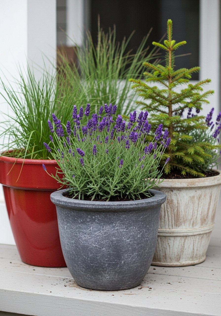
I ripped out the tiny manicured boxwood and planted three planters with native grasses and a small spruce. Use an odd number, and vary heights so you get a 1-2-3 visual staircase. For the front porch, pick planters in terracotta, matte black metal, and a woven urn for contrast. I like self-watering metal planters because they cut down on watering. A common mistake is planting everything the same height. Instead, choose one tall anchor plant, a mid-height filler, and a trailing piece. Native grasses handle the mountain sun and look better as they age, which is the point.
Weathered Metal Accents and Functional Gutters for Rustic Modern Detail
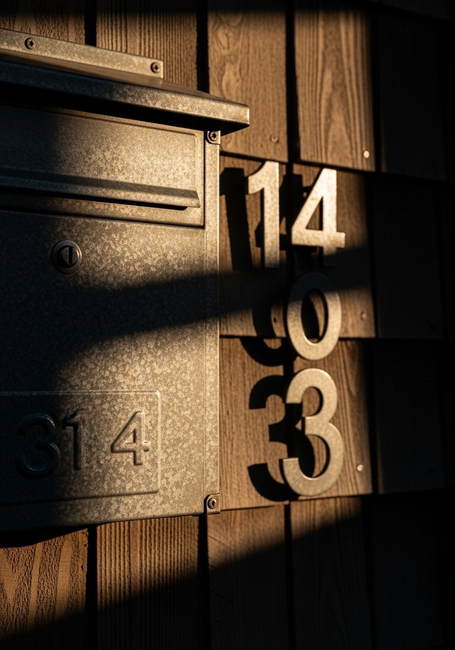
We swapped shiny new hardware for weathered steel accents and it made the facade read like it belonged in the landscape. Think mailbox, house numbers, and gutter downspouts in a rusted finish. Metal looks intentional when balanced with wood and stone, so keep metal accents under 15 percent of the visible facade. I installed metal house numbers and replaced gutters with a matte black aluminum that doesn’t glare. The mistake is mixing too many metal tones. Pick one family, like warm weathered steel or matte black, and stick to it. The finish will patina, which is part of the charm.
Natural-Fiber Porch Textiles and Rug for an Inviting Threshold
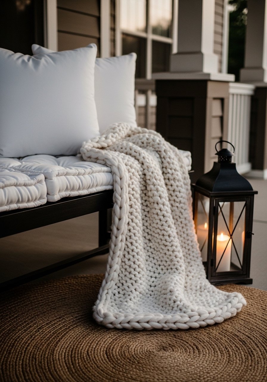
I spent $40 on a jute rug and the porch stopped feeling like an entryway and started feeling like an outdoor room. Use a low-profile natural fiber rug sized so two people can stand on it comfortably, usually 2×3 or 3×5 depending on your stoop. Add a bench with a 22-inch down-filled linen cushion and a chunky knit throw for shoulder contact. A common misstep is using indoor rugs that rot in wet climates. Choose outdoor-rated natural fibers or treated jute and rotate seasonally. Pair this with layered planters and low lighting for a porch that actually gets used.
Low-Profile Path Lighting for Soft Nighttime Glow
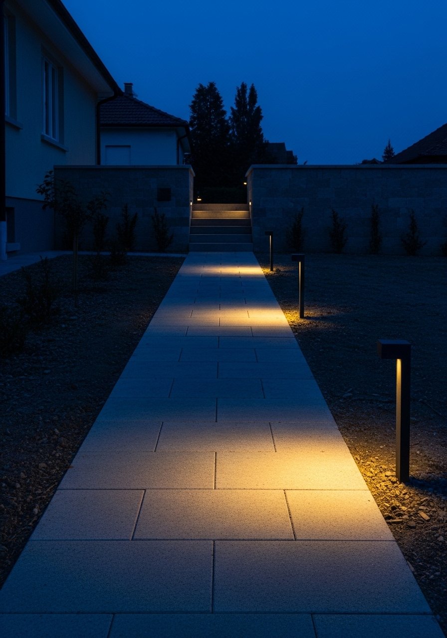
Path lighting makes a house read as safe and intentional after dark. I installed low bollard lights every 6 to 8 feet along our walkway and they create a pleasant rhythm. Use warm LED bulbs around 2700K to keep the light soft. I like low-profile LED bollard lights that are rated for damp locations. The mistake people make is over-lighting. Aim for pools of light and leave negative space so the house breathes. This also helps with evening curb photos and prevents washed-out door colors that happen when porch lights are too bright.
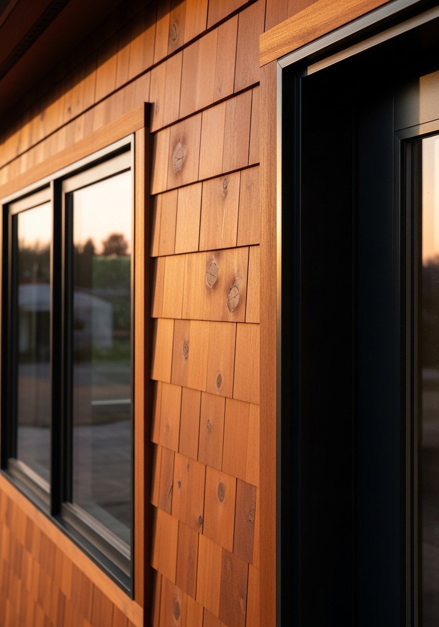
Mixed-Texture Roofline with Cedar Shingles and Metal Accents
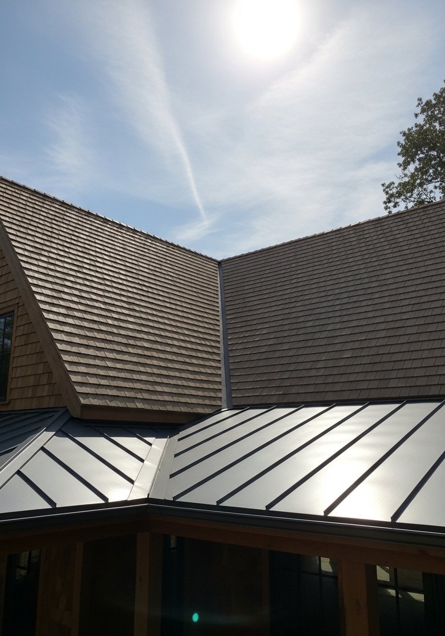
We replaced a cheap composite shake with real cedar shingles on the front-facing roof and it changed the whole silhouette. Cedar adds grain and the shingles mellow over time. Combine cedar with a small metal porch roof in a complementary tone to break up massing. Use cedar on the gable and keep metal accents to caps and porches under 20 percent of surface area, otherwise the house reads too industrial. For flashing and trim, a standing-seam metal roof kit made it easier for the contractor to tie everything together. The common mistake is matching metal to trim instead of to the landscape. Pick the metal tone that looks good against trees and stone.
Exact-Match Paint Touch-Ups with a Portable Spectrophotometer
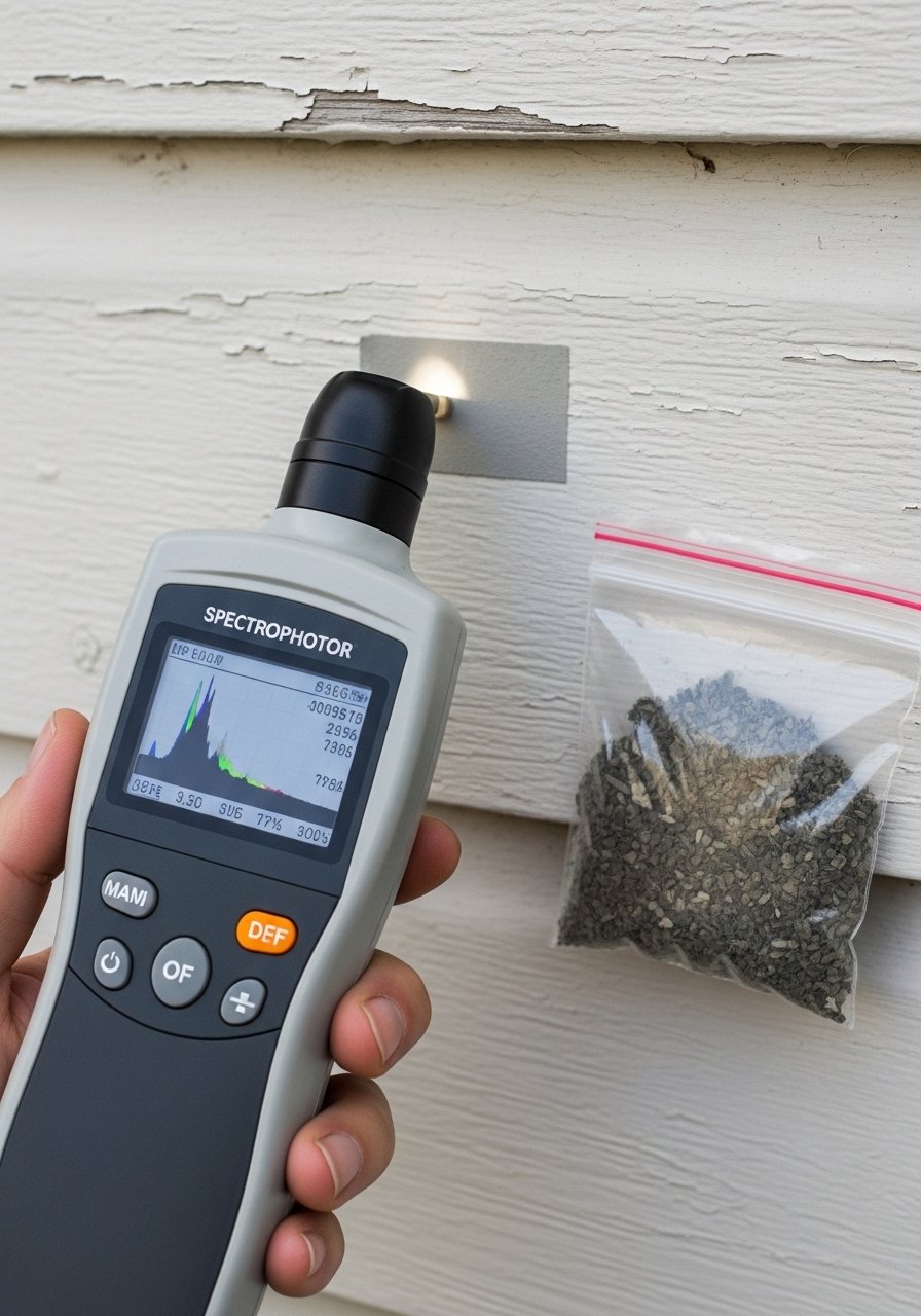
If you are saving a color or patching a faded spot, the spectrophotometer is underrated for exteriors. I rented a portable spectrophotometer for a weekend and scanned old siding. Tech scanners nail it 9 out of 10 tries now, but you still need to eyeball the result. Ask the rental shop for reflectance mode scans and bring home a 12×12-inch test board. A big mistake is matching under shop fluorescents and then painting the house, which is why most mismatches happen from bad lights. I ordered a portable spectrophotometer search to find rental and buy options. Use Base 1 for light colors and Base 4 for deeper tones, and always view the sample at sunrise and afternoon sun before committing to a full coat.
Your Decor Shopping List
Textiles
- Honestly the best $40 I have spent. Natural jute rug, 3×5 in camel for porches
- Chunky knit throw in cream (~$35). Drape over bench for texture
Wall and Entry Decor
- For the deep green door finish, try durable exterior door paint in sample tubs
- Found these while looking for something else. Weathered metal house numbers (~$25) age beautifully
Planters and Plants
- Self-watering metal planter, 12-inch (~$45) for low-maintenance greens
- Dwarf evergreen, 3-gallon pot for porch anchors, similar at local nursery
Hardware and Lighting
- Low-profile LED bollard lights, set of 4 (~$120) for safe warm light
- Semi-transparent cedar stain, 1-gallon if re-staining siding
Shopping Tips
White oak beats dark wood in 2026. Design feeds have shifted completely. White oak floating shelves work for exterior trim accents that need a lighter touch.
Grab durable exterior door paint sample for $7 each. Paint a 12×12-inch patch and photograph it at sunrise and sunset before you commit.
Curtains for porches sound weird until you try them. Use outdoor-rated linen panels and let them kiss the floor for movement.
Everyone buys five small succulents. One single 6-foot faux fiddle leaf fig holds the corner visually and needs zero care.
Frequently Asked Questions
Q: Can I mix cedar siding with painted trim without it looking disjointed?
A: Yes, if you keep the wood as the dominant surface and limit painted trim to around one third of the facade. A good rule is two thirds natural material, one third painted accents. Test the trim color on a 2-foot square before you commit.
Q: How do I stop my exterior paint from looking different after the contractor paints?
A: Test in real light. Most mismatches happen from bad lights. Bring home a 12×12 sample and view it at dawn, midday, and dusk. Ask your contractor to use the same base type for deep versus light colors, Base 1 for lights and Base 4 for darker shades.
Q: What do I actually need for durable porch textiles?
A: Outdoor-rated fibers or treated jute, a 3×5 or 2×3 rug sized so two people can stand on it comfortably, and fade-resistant cushions. Try 22-inch outdoor cushions that have removable covers.
Q: Are faux plants acceptable for a mountain exterior?
A: Use them strategically. Real evergreens and native grasses are best near the foundation. Faux large trees work well on porches where height is needed without maintenance. One faux tall plant has more impact than many small real ones.
Q: How far apart should I space path lights?
A: Space low bollard or path lights every 6 to 8 feet to create consistent pools of light. Avoid continuous bright lighting. Low-profile LED bollard lights in warm 2700K give a softer glow.
Q: Is renting a spectrophotometer worth it for exterior touch-ups?
A: Yes if you have tricky fading or discontinued colors. Tech scanners nail it 9 out of 10 tries now, but always eyeball the sample at multiple times of day. Rent for a weekend, scan in reflectance mode, then test a full-size patch before rolling the whole wall.