

My friend walked into my apartment last month and said "this looks like a real adult lives here." Highest compliment I have ever received. I did not add anything huge, just traded bright prints for chunky linens, switched one lamp to warm dimmable light, and moved a rug so the table sat on it. Those small moves made the whole room feel intentional.
These ideas lean moody-modern with touches of vintage and warm textures. Most suggestions stay under $150, with a few splurges that matter. They work for dining rooms, kitchen nooks, and any small space that needs depth rather than more stuff.
Layered Textiles For A Moody Dining Room
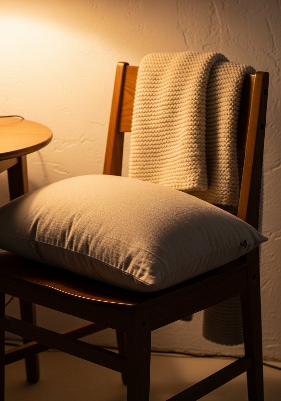
The moment I added 22-inch down-filled linen pillow covers to my mismatched chairs, guests sat down and stayed. Layered textiles stop a moody room from feeling flat, because deep paint plus smooth wood can look too severe. Go for a base of two neutral textures, then one bold accent, using an 80/20 rule so 80 percent is calm and 20 percent pops. I used velvet pillow covers for the accent and a chunky knit throw for the back of a chair. Common mistake is using the same texture everywhere, which makes a room feel staged. A small detail most guides skip is measuring pillow size against chair backs so the pillow does not hide the chair silhouette. For budget swaps, check Target or HomeGoods for similar pillow covers.
Dark Walls With Warm Wood Accents
If you paint one wall dark, add warm wood immediately. Dark walls can look cold if paired only with cool metals or black frames. I painted my wall in a deep gray and added a white oak sideboard, which warmed the whole palette. A common fail is matching samples under store lights, which is why Lighting trips up seven in ten paint jobs. Take 2×2 foot swatches home and view them at dinner time. For a fast upgrade try white oak floating shelves to echo the table tone. A useful ratio I use is one medium wood piece per three dark surfaces so the wood reads intentional rather than accidental.
Statement Pendant For Intimate Lighting

Swapping your ceiling fixture changes the mood in ways paint alone cannot. I replaced a bright flush mount with a low amber pendant and suddenly dinner felt less like eating under stadium lights. Aim for a pendant that sits 28 to 34 inches above an 30-inch-high table. Too high and the light reads like a ceiling fixture, too low and people bump heads. I recommend an adjustable dimmable pendant and paired mine with dimmable LED bulbs. People often pick a fixture by looks alone and forget scale. One trick that rarely gets mentioned is comparing the fixture's beam spread to your table width, so you get a pool of light centered on the table.
Mixed Metals For Modern Vintage Vibe

For years I matched all my metals and the room read like a catalog. Now I mix brass with black iron and a dark nickel tray and it feels layered and lived-in. Mixing metals gives a curated vintage vibe when you use one metal as the anchor and add two accents. I used brass candleholders on the table and a black iron chandelier above. The mistake people make is scattering small metal bits randomly. Instead, place metals in groups so each finish has room to breathe. A small detail I use is to repeat the anchor metal three times around the room, in hardware, lighting, and tabletop.
Velvet Seating For Plush Formality

Velvet reads expensive and helps a moody palette feel rich rather than gloomy. I swapped two side chairs for velvet ones and the table instantly looked like a set. Velvet hides wear well and invites touch, which matters in a room where people linger. If you want to keep costs down, buy two velvet end chairs and use bench seating on the sides. I bought velvet dining chairs during a sale and used slipcovers for the bench. A common oversight is not checking leg height with your table so your knees fit comfortably. A detail most guides skip is brushing the nap to control shine before guests arrive.
Low-Light Plants For Moody Corners
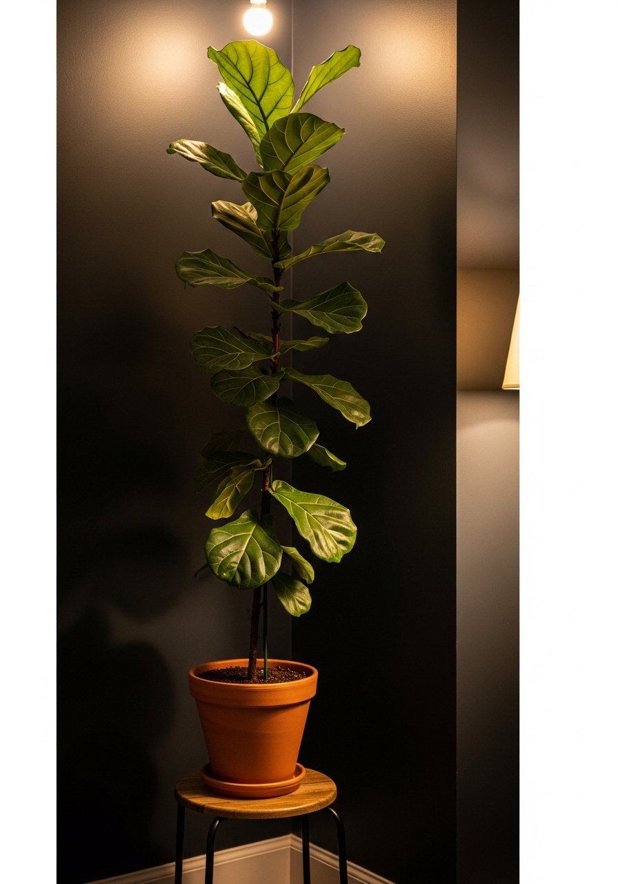
Plants rescue dark corners and they do it quietly. I once tried five small succulents and they disappeared. Replacing them with a single 6-foot plant gave the corner presence and cut the heaviness. Everyone buys five small succulents. One single 6-foot fiddle leaf fig has ten times the visual impact. For real plants, choose varieties that tolerate lower light like snake plants or ZZs. Renter-friendly note, put a plant on a tray to protect floors and use an artificial option where maintenance is a problem. A detail I care about is pot scale, make the pot visually half the plant height for balance.
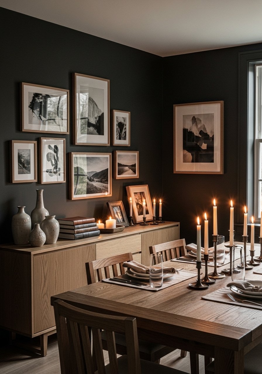
High-Contrast Table Styling For Drama

A moody room benefits from contrast on the table so elements pop against dark surfaces. Use a light dinnerware set paired with dark linens and a metallic accent. I use a charcoal linen runner with white plates and brass flatware and the arrangement reads intentional. One mistake is using too many small pieces which flattens the look. Keep shapes simple and scale large. I use linen napkins in a muted tone and a minimal centerpiece. Here is a detail most articles forget: the runner should be half the table width so it allows plenty of table edge to show, which keeps the dark paint from swallowing the styling.
Oversized Art To Anchor Deep Hues
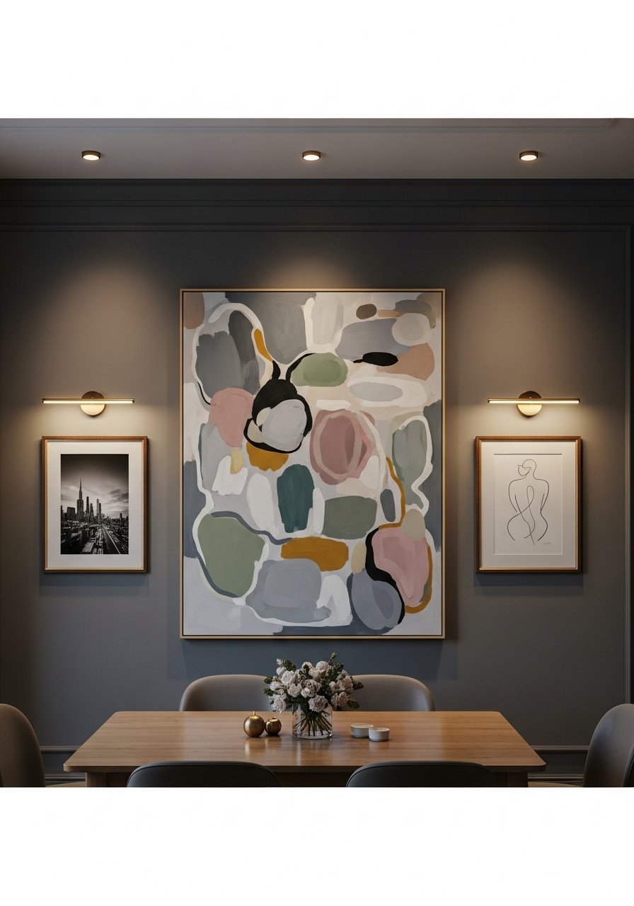
My dining wall used to have three small prints and it never settled. Swapping to one oversized canvas gave the room an anchor and made the deep wall color feel deliberate. Oversized art also reduces the number of nail holes if you move things later. A common error is hanging art at eye level for a living room, which is wrong for dining. Hang the center of the art roughly 6 to 8 inches above the chair backs. I found an affordable large canvas and softened it with matte black frames for the smaller pieces. A tip people miss is to step back with dinner plates in hand to see how scale reads while seated.
Reflective Surfaces To Bounce Warmth
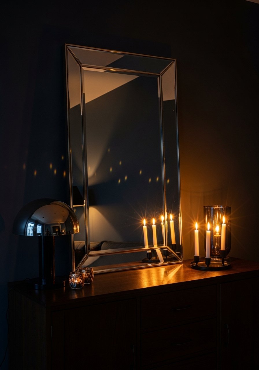
Adding one oversized mirror changed the way my moody dining room read on cloudy days. Mirrors reflect warmth from lamps and candles and they make dark rooms feel less closed. I leaned a round mirror against the wall so it could be moved when rearranging. The typical mistake is placing a mirror opposite a window and getting glare, so angle it slightly or place it near a lamp. I like large round mirrors with a thin metal frame so the reflection feels soft. A practical detail is to clean both sides before a dinner party because smudges show up in low light.
Renter-Friendly Paint Tests And Swatches

If you rent, you cannot repaint every week to test a color. I used foam-core mockup boards painted with full coats and propped them in the corner. Lighting trips up seven in ten paint jobs, so test at the time of day you eat. Also, Most folks grab a rival brand's formula to save cash on out-of-stock colors, which works but test the final finish too. I bring a small bag of textiles to compare against the swatch and take photos under dimmable lamp light. For a no-damage renter option try peel-and-stick swatch sheets. A helpful extra is to note the room temperature when you test because paint can look slightly different on humid days.
Sheen Ladder For One Color Across Trim

I kept one color and changed sheens and the whole room read layered instead of monochrome. Sheen shifts color perception, so always test the finish. Try flat on the wall, eggshell on trim, and satin on doors to see how light reflects differently. A common blind spot is assuming sheen only affects durability. It changes depth too. I tested sample strips and found a 5 percent tint added at the counter improved warmth when the paint dried. Half the machine matches need a quick eye fix to nail it. For a quick trim pick, I used eggshell interior paint sample pots. The small detail most people skip is comparing the same color in two coats versus three coats because thin application can read lighter.
Your Decor Shopping List
- Honestly the best $40 I have spent. Velvet pillow covers, set of 4 in deep emerald and charcoal, 22-inch, down-fill compatible. Similar at Target.
- For the pendant trick, get scale right. Dimmable amber glass pendant light (~$80-150). Check wiring requirements.
- Found these while looking for something else. Brass candleholders set (~$25) to repeat the warm metal.
- Chunky texture for chairs. Chunky knit throw blanket in cream (~$35-55). Works as a runner or chair drape.
- For oversized art, try this. Large canvas abstract print, 36×48 inches (~$60-120) in muted tones.
- Renter testing essentials. Peel-and-stick paint sample sheets and a small pack of foam-core mockup boards.
- Plant with presence. 6-foot artificial fiddle leaf fig for low light spots, pot included.
- Sheen tests. Paint sample pots variety pack to test flat, eggshell, and satin on the same wall.
Shopping Tips
- White oak beats dark wood in 2026. Design feeds have shifted completely. These white oak floating shelves look current, not dated.
- Grab velvet pillow covers for $12 each. Swap them every three months and the whole room feels different.
- Curtains should puddle or kiss the floor, never hang halfway up. These 96-inch linen panels are right for standard 9-foot ceilings.
- Lead with scale, not pattern. Large neutral area rug 8×10 grounds a dark table without competing.
- Everyone buys tiny plants. Skip the clutter and pick one large statement plant for architectural impact.
Frequently Asked Questions
Q: Can I mix moody paint with modern furniture without it looking mismatched?
A: Yes. Use warm wood or one warm metal to bridge the gap. Repeat that element three times across the room so it feels deliberate.
Q: What size pendant should I choose for a round table?
A: Pick a pendant that is about 12 inches smaller than the table diameter for a balanced look. Adjust height 28 to 34 inches above a standard 30-inch-high table.
Q: How do I test paint colors in a rental without damaging walls?
A: Paint foam-core mockup boards and prop them where the final color will hang. Peel-and-stick sample sheets also work and remove cleanly.
Q: Should I mix metals in a moody dining room?
A: Mix them, but anchor with one finish. Use the anchor in lighting, a big hardware piece, and a tabletop accent, then sprinkle a second and third finish sparingly.
Q: How do I pick the right rug size for under my dining table?
A: Go bigger than you think. Chairs should stay on the rug when pulled out. For a standard table, an 8×10 rug is a safe starting point.
Q: My paint match looks slightly off after it dries. What now?
A: Bring the can back and ask for a 5 percent tint tweak, or add a small white tint by eye to warm it. Half the machine matches need a quick eye fix to nail it.