

My neighbor, who insists she does not care about paint, stood on my porch and asked why my house felt inviting the minute she walked up. I realized I had matched everything to the light on the street, not to the light that hits my own facade. After repainting the trim and testing samples at different times of day, the house finally looked like it belonged in the neighborhood and not like it was trying too hard.
These combos lean soft coastal and cottage-core with a few modern pastel twists. Most ideas are budget friendly, usually under $150 for paint and accents, with a couple splurges for metal fixtures. They work for porches, small cottages, townhouses, and even apartment balcony facades when you only do the door and trim.
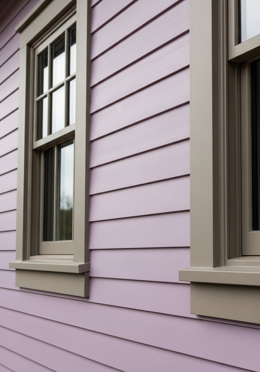
Coastal Mint Siding with Soft Cream Trim for a Beachy Porch

Mint siding reads fresh without being loud when paired with warm cream trim. What makes it work is balance, aim for a 70 to 30 split where the siding is the 70 percent field and the trim is the 30 percent anchor. For paint, get sample paint pots and test a 2-foot square at eye level. A common mistake is testing on shaded spots that hide blue bias. For a front door, try a saturated mint enamel like durable exterior door paint and two coats, one gallon covers roughly 350 square feet so plan accordingly. Pair with matte black house numbers to ground the look.
Blush Pink Shutters with Dove Gray Siding for a Vintage Cottage

Blush shutters give a cottage a human scale without feeling sugary if the siding is a muted dove gray. I learned the hard way that pink reads more orange under warm LED porch lights. Test samples under your actual evening lights because seven out of ten bad matches come down to wrong lights. Avoid full gloss on shutters or they will look toy-like. Use 22-inch planters in natural wood to repeat the warm tones and keep the ratio of blush to gray about one small accent per 12 feet of facade.
Powder Blue Door with Off-White Clapboard for Classic Charm

A powder blue door is a one-piece personality move that costs very little but reads like a thoughtful update. I sanded lightly and used a satin enamel so the blue kept depth without reflecting every sun flare. The mistake people make is starting with the brightest paint they see online. Instead, mix a slightly grayer powder blue sample for the door. Add a weatherproof wreath in natural fiber and a brass door knocker for contrast. In my experience, small brass accents make pastels look intentional instead of accidental.
Sage Green Trim with Warm Beige Stucco for Timeless Suburban Facade

Sage trim lifts beige stucco without competing with landscaping. Match trim to the direction of light. For north facing walls, nudge the green slightly warmer so it does not read gray. A common fail is painting trim in the same sheen as siding. Use a higher sheen for trim and a lower sheen for stucco to hide imperfections. For renters, try painting a removable 2×2 foot board to test contrast. I also brought a paint chip into the hardware store and most of the time eight in ten times, stores nail competitor formulas spot on when you ask for the nearest match.
Lilac Clapboard with Pale Taupe Accents for Subtle Personality
Lilac works best when it looks like a weathered heirloom. Mix a touch of gray into the lilac sample so it will read soft under bright sun. One specific trick I use is to let sample patches cure for 48 hours before judging. People often pick wet samples and get disappointed when dry color shifts. Keep accent pieces small, like a taupe mailbox and a narrow bench, so the lilac stays the star without overwhelming the curb.
Peachy Coral Door with Sea Glass Siding for Warm Welcome

A coral door reads welcoming in person, but it can read neon in photos if the saturation is too high. Start with a coral tint that has a 10 percent gray boost to tone it down. I use one coat of primer and two top coats on doors because they take a beating. For hardware, pick brushed nickel to keep it modern. A common slip is painting the whole facade coral. Keep it to the door and small accents, then use a soft sea glass for siding to keep the palette cohesive.
Pale Lemon Porch Ceiling with White Trim for Cheerful Cottage Vibe

Painting the porch ceiling pale lemon is a tiny job that changes the mood of the whole entrance. It reads like the sky does on cloudy days and brightens even when it is overcast. The rule I follow is to keep ceiling color two shades lighter than the window trim. A misstep is using high gloss which shows every brushstroke. Use a satin exterior paint and a weatherproof pendant light to make the ceiling feel like a room rather than an afterthought.
Dusty Blue Siding with Sandstone Foundation for Coastal Modern Homes

Dusty blue has the breath of the sea without being literal if the foundation uses sandstone tones. I like a 60 to 40 balance where the foundation band is the smaller visual weight. People assume blue should be pure, but adding warm beige into the dusty blue sample keeps it from going cold in north light. If your siding is textured, remember scanners can struggle. Bring a sample board of the texture when matching and test at sunrise and late afternoon because Most scanner matches hit over 95% on first try if you follow light rules.
Minty Gray Garage Door with Pale Rose Accents for Subtle Interest
Garage doors are a large surface, so subtlety matters. Minty gray keeps things soft while pale rose accents add lift without shouting. For large surfaces, paint one entire panel and stand back 20 feet to get the real effect. A frequent mistake is painting small sample squares and making a decision up close. I recommend two coats applied with a sprayer for even coverage and a garage door paint kit if you plan to do it yourself.
Soft Teal Shingles with Creamy White Trim for Cottage Rooflines
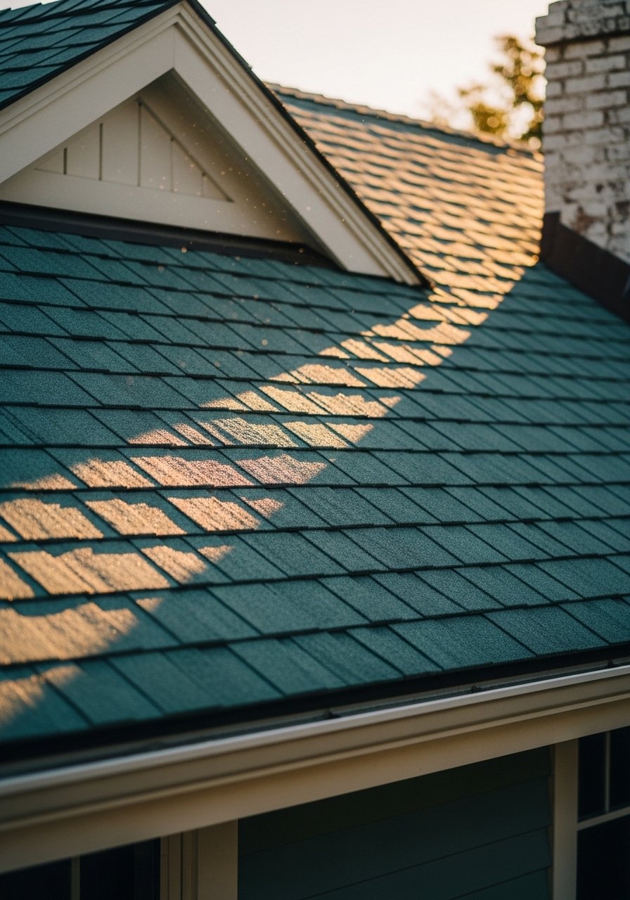
If you have shingles, color behaves differently because of the texture and shadow. Soft teal absorbs shadow and reads deeper than flat samples. I test by painting a 12-inch square on a sample shingle and checking it at different angles. A common mistake is matching from brand digital swatches alone. Bring the swatch to the roof if possible. For longevity, ask about UV-resistant topcoats since sun fade rates differ by material and can change the hue over a season.
Seafoam Green Entry Nook with Warm Oak Accents for Midcentury Curb Appeal
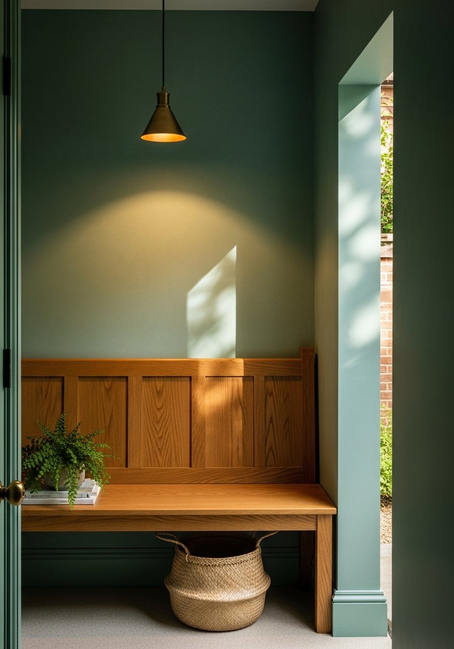
Seafoam green pairs beautifully with warm oak because the wood stops the green from reading too cool. I used a 1:1 plan for the accent ratio, so for every square meter of seafoam I added an equal measure of oak in trim or furniture. A mistake I see is matching new wood to painted trim rather than to existing wood. Bring an actual wood sample to the paint counter. If you want a quick upgrade, swap the porch seating to warm oak and pick up an outdoor oil for teak and oak to keep it looking fresh.
Powdered Mint with Steel Blue Accents for Urban Townhouses

For tighter urban lots, powdered mint keeps facades calm while steel blue window frames add graphic lines. I avoid high contrast because narrow streets can make colors fight with shadows. One concrete tip is to keep the frame accents to 10 to 15 percent of the visible facade area. People sometimes overdo trim accents and the house looks busy. Use a semi-gloss on metal frames for durability and try a rust-resistant metal paint if you have metal railings.
Soft Lemon-Green Garage Trim with Porcelain White Walls for Scandinavian Calm

This combo is about restraint. Porcelain white walls act as a canvas and the lemon-green on garage trim gives just enough personality from the curb. My rule of thumb is to limit the lemon-green to trim and a single focal element like a mailbox. A common fail is painting too much lemon-green which reads like a highlighter. If you rent, paint a removable board and hang it near the garage for a week to see how it looks in different weather. For durability, look for exterior paints labeled for masonry if your walls are stucco.
Peach Blush with Warm Gray Banding for Layered Facade Interest

Banding the facade with warm gray at the lower third creates architectural interest and keeps peach blush from feeling juvenile. When I first tried peach without a grounding band it looked like a dessert. The avoidance here is to band at the right height. Start the band 2 to 3 feet above grade so it reads like intentional basework, not a paint mistake. For the band, use a tougher finish since it will get splashed more. A contractor-grade exterior paint in the band color will save touch up headaches.
Your Decor Shopping List
Textiles and Soft Accents
- Honestly the best $40 I have spent, 22-inch linen pillow covers, set of 4 in neutral tones for porch benches
- Outdoor throw blanket in cream (~$30), use at benches and entry chairs
Hardware and Fixtures
- Brass door knocker (~$25) to pair with pastel doors
- Weatherproof porch pendant light (~$60-120), pick brushed nickel or black
Paint and Prep
- Exterior paint sample pots, set of 6 for testing in different lights
- Contractor-grade exterior paint, 1-gallon (~$30-60), covers about 350 square feet
Small Decorative Items
- Found these while looking for something else, brass house numbers (~$15-30) to anchor soft palettes
- Wooden planters, pair for repeating warm accents
Tools and Maintenance
- Garage door paint kit if you plan a DIY large surface
- Teak and oak outdoor oil (~$20) to protect warm wood accents
Most of these items are easy to find at Target or HomeGoods if you prefer to see them in person.
Shopping Tips
White oak beats dark wood in 2026. Design feeds have shifted completely. White oak floating shelves look current, not dated.
Grab velvet pillow covers for $12 each. Swap them seasonally and the entryway feels updated without repainting.
Curtains and porch textiles should touch or puddle the floor, never hang halfway up. 96-inch linen outdoor panels are right for standard 9-foot porch ceilings.
Everyone buys five small succulents. One single 6-foot artificial fiddle leaf fig has ten times the visual impact for porch corners.
Frequently Asked Questions
Q: How do I test pastel colors on an exterior without repainting the whole wall?
A: Paint removable 2×2 foot boards and hang them where the facade gets real light. Move them to shaded and sunny spots and check at dawn, midday, and dusk. That way you can judge color shifts without committing.
Q: Can I match a discontinued paint color from a photo?
A: You can often get very close. Bring a physical chip or a painted sample to the store and ask for a cross-brand formula. Eight in ten times, stores nail competitor formulas spot on when you ask nicely.
Q: My house looks different in photos than in person, why?
A: Cameras compress dynamic range and often boost saturation. Check paint samples in real life and trust the eye in different lights. Most scanner matches hit over 95% on first try if you follow light rules, but always verify samples outside.
Q: Are pastel exteriors harder to maintain with sun fade?
A: Some pastels will fade faster on high-UV facades. Use UV-resistant exterior paints and plan for touch ups on southern exposures. For a quick test, tape a small sample and observe it over a season if you can.
Q: I rent and want a pastel door without painting the whole building. What works?
A: Use a high-quality satin exterior paint on the door only, or install a prefinished door wrap. Another renter-friendly trick is a temporary, removable painted panel leaned against the door to test the look before asking for permission to paint.