
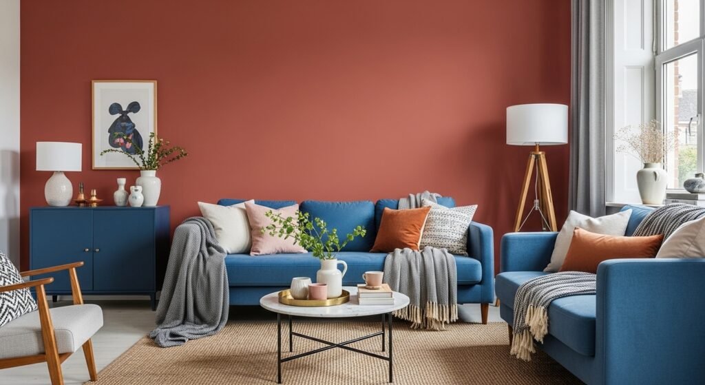
My living room had nice furniture and decent lighting but it still felt like a waiting room. Took me embarrassingly long to realize everything was the same height and the colors were all polite neutrals. Painting one wall in a warm terracotta and adding a few jewel-toned pillows made it feel like us instead of a showroom.
These ideas lean warm-modern and vintage-boho depending on how you mix them. Budgets run from thrift friendly to a couple splurges around $100 to $150. Works in living rooms, bedrooms, dining nooks, powder rooms, and even small entryways that feel forgettable.
Burnt Orange Living Room With Teal Accents
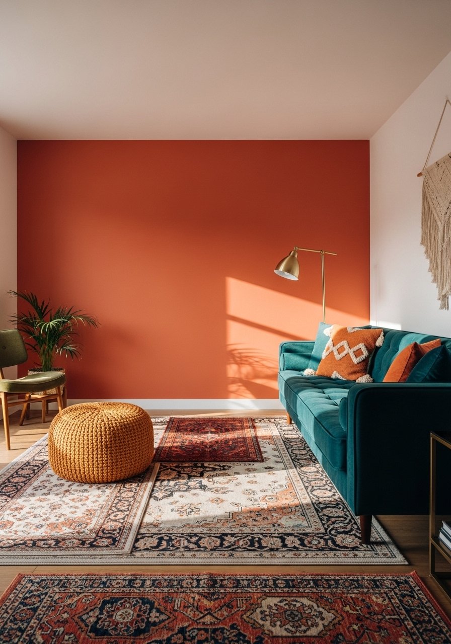
I painted one long wall in a deep burnt orange and everything finally had personality. It works because the teal pops without fighting the orange, using roughly a 60/40 rule where the terracotta is the dominant field and teal appears in upholstery and one large rug. Budget here was under $200 for paint and two throw pillows. I used a high-pigment option, and you can try a sample like Behr Terra Cotta Clay sample before you commit. A common mistake is painting every surface the same dark tone, which makes the room feel like a cave. For north-facing rooms, pick a slightly lighter burnt orange so it reads warm instead of flat.
Peach Terracotta Living Room With Blush Trim
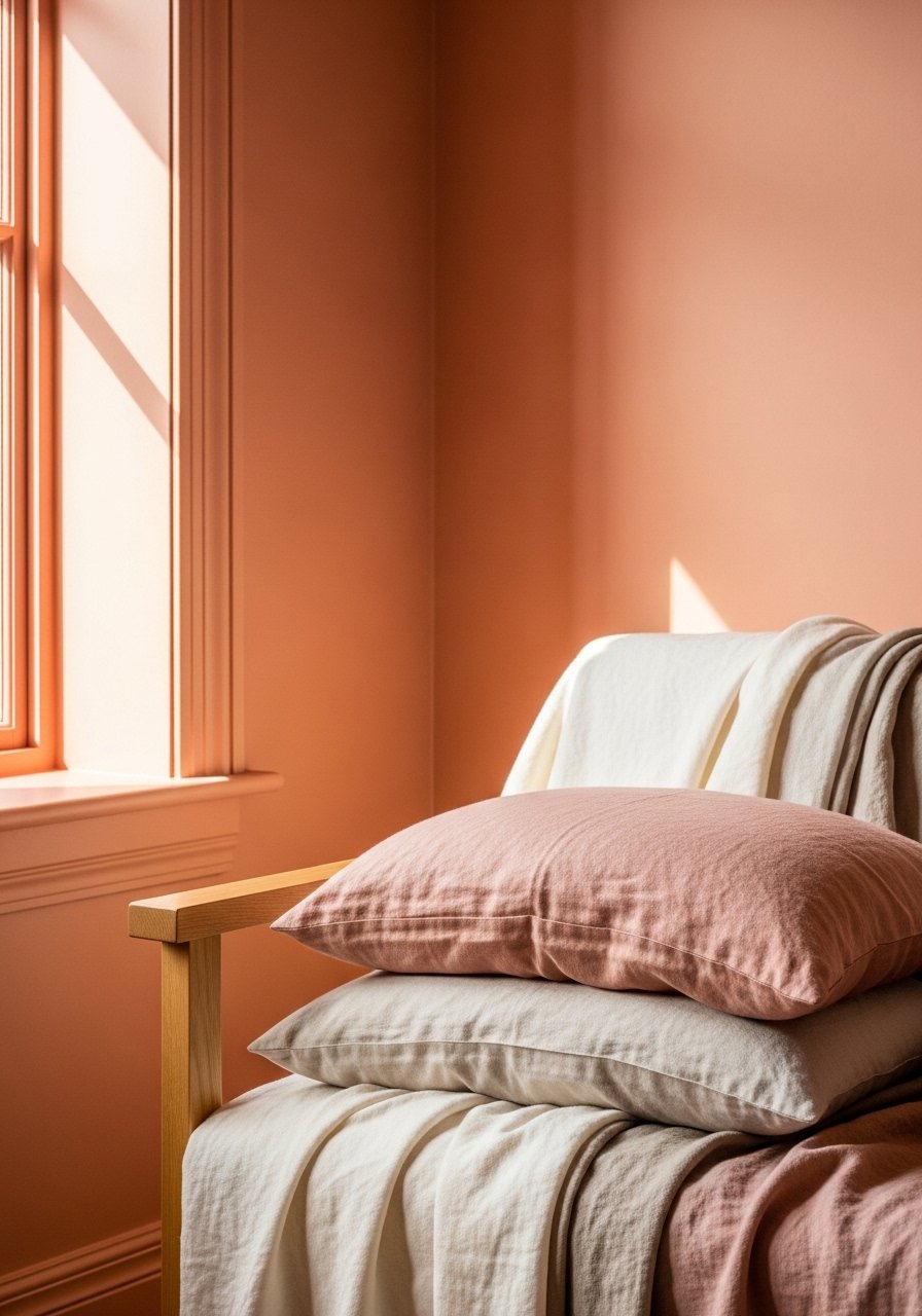
When my tiny living room started to close in, I swapped a heavy brown for a peach terracotta and painted the trim in a blush tone. The trick is keeping blush at about 30 percent of the palette against 70 percent terracotta to keep the space airy. Works great in apartments under 150 square feet and it is renter-friendly if you test small sample pots first. I paired the walls with linen curtains and 96-inch linen curtain panels to add vertical drama. People often overdo dark trim, which makes peach look muddy. Match undertones and you avoid that pitfall.
Deep Red Dining Nook With Emerald Seating
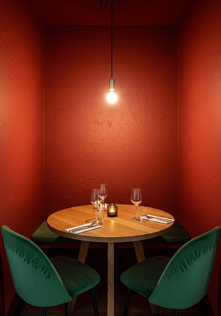
My friend painted her dining nook a red-ochre terracotta and suddenly guests lingered longer. This shade handles low light better than bright orange and pairs beautifully with emerald chairs. Keep white on shelving or plates to break it up. Budget runs higher for velvet chairs, but you can swap seat cushions for a cheaper trick. Try searching for an inspired finish, like Tuscan red paint sample to see how it sits in your light. A mistake is using too many warm wood tones, which can feel heavy. Add a 1:3 rule for trim, one trim color per three walls, to keep things grounded.
Coral Terracotta Bedroom With Lavender Bedding
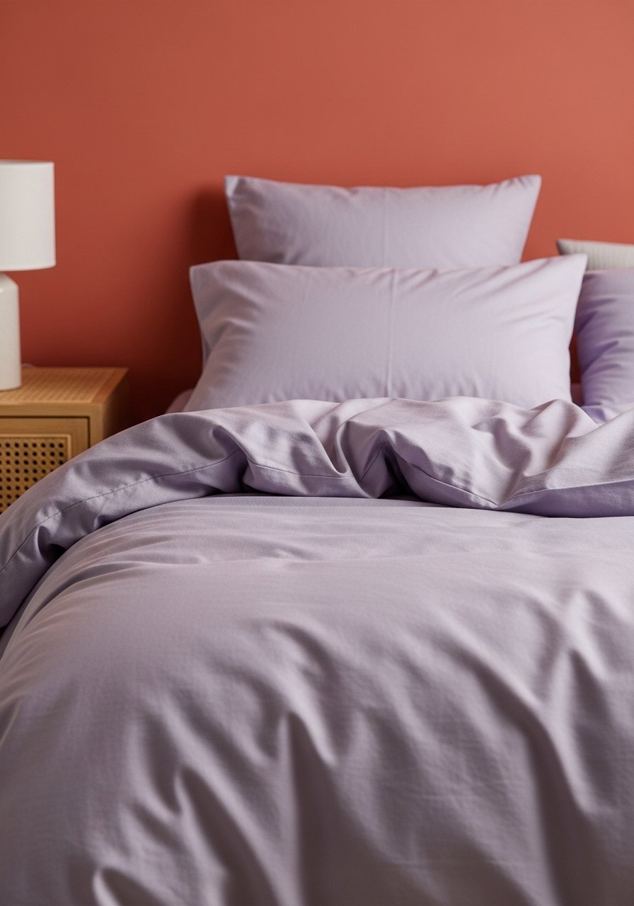
I swapped cool gray bedding for lavender against a coral terracotta wall and slept better immediately. Coral undertones pair naturally with pinks and lavenders at equal saturation for a calm, soft look. Keep furniture minimal and pick down or synthetic down pillows in a 22-inch size to get the plush look without a lot of fuss. I used a coral-friendly paint sample like coral-terra-cotta-paint-sample and tested it near the bed, since bedroom light changes a lot through the day. Avoid bright white linens that will fight the coral and make it look harsher.
Pinky-Brown Kitchen With Light Olive Cabinets
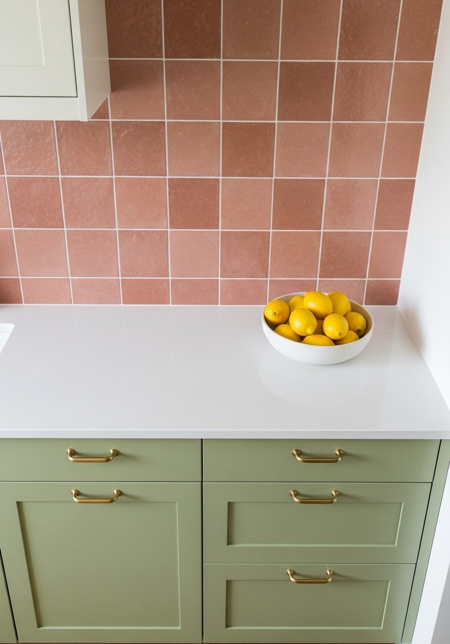
I did this in a rental-friendly way by painting just the cabinet faces in olive and adding a pinky-brown accent wall behind open shelving. Pinky-brown keeps the kitchen cozy without feeling dated. If you cannot paint, use adhesive cabinet film or peel-and-stick backsplash tiles and test with a small swatch of olive like sage-olive-paint-swatch. Many people mismatch undertones and the olive reads muddy next to coral-pinks. Match warm to warm and cool to cool to avoid that clash. Durability matters in kitchens, so pick a wipeable finish for high-use surfaces.
Tuscan Red Office With White Shelves
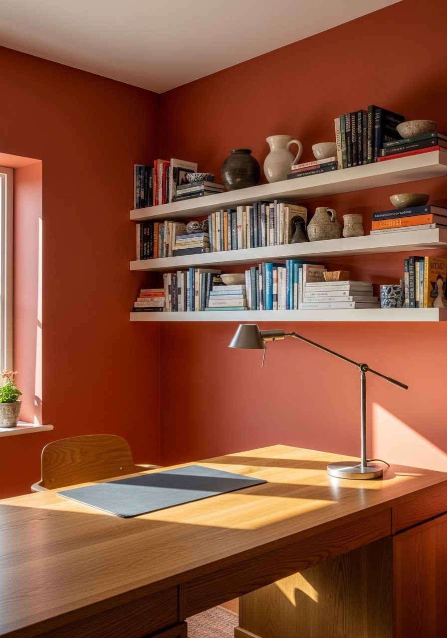
I painted my home office a Tuscan red and suddenly it felt like a proper workspace instead of a desk shoved in a corner. The white shelves break up the color and keep the space from closing in. For focus areas, dark terracotta beats sterile gray any day. Keep wall color on about 60 percent of the room and use white on shelving and trim for the other 40 percent. I used a sample similar to rookwood-terra-cotta-paint-swatch to check how morning light hit the wall. A common mistake is painting the whole room dark without testing light at different times of day.
Blush Terracotta Hallway With Baby Blue Doors
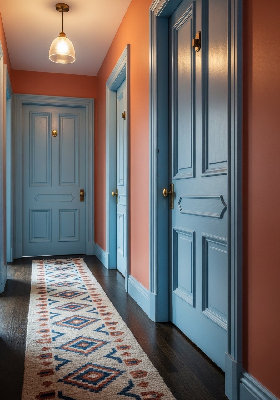
My hallway used to feel like a corridor in an office building. Blush terracotta on walls with baby blue doors immediately made it feel intentional. Use lighter terracotta shades for narrow spaces and paint doors a contrasting but low-saturation color. For runners, choose a 2.5×8 size in natural fiber. People often hang small artworks that make the hall feel cluttered. One statement mirror and a single runner make a bigger impact. If you rent, try peel-and-stick door films or swap in thrifted doors with a coat of paint.
Red Ochre Entry With Lilac Rug
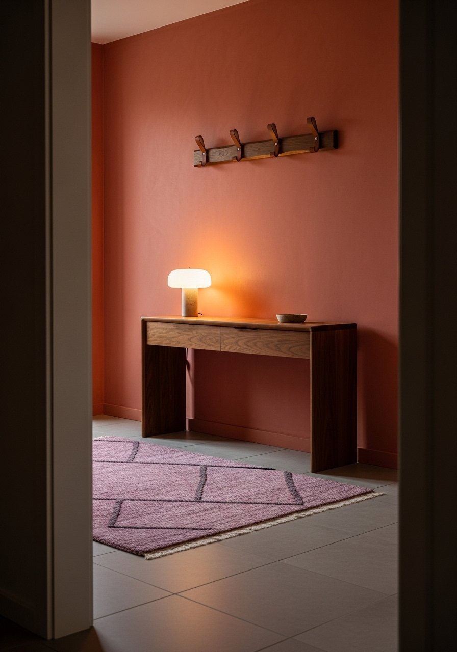
I wanted the entry to read warm and slightly grand without being precious. Red ochre walls plus a lilac rug balances warmth and soft color in a way that no one expects. The rug provides about 30 percent of the room's color pop against 70 percent terracotta, which keeps it grounded. I recommend an 18×30 runner for small foyers and a 2×3 accent rug for tiny areas. A mistake people make is picking a tiny rug that vanishes under the door. Swap with a durable jute underlayer if you have pets because terracotta hides fur but shows dust. For a rug option try lilac-entry-rug-2×3.
Terracotta Accent Wall With Sapphire Sofa
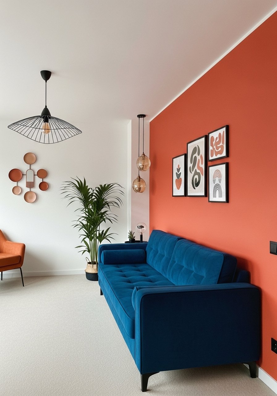
The accent wall saved my small living room from feeling bland. One wall in terracotta gives you drama without overwhelming. Pairing the wall with a sapphire sofa follows the 60/40 visual rule, where the terracotta anchors and the sofa provides the complementary jewel tone. I recommend measuring your sofa and keeping the rug at least 8 inches in front of the legs for balance. If you rent, try large-scale artwork printed on canvas leaning against the terracotta wall to mimic the painted-look impact without permanent changes. Try a sample finish first like teracotta-accent-paint-sample.
Light Terracotta Powder Room With Deep Ruby Towels

Powder rooms are where bold color feels comfortable, because the scale is small. I painted my half bath a light terracotta and layered deep ruby towels and a brass sconce for drama. Keep the terracotta on about 70 percent of surfaces and use textiles for the remaining 30 percent so the space breathes. People often pick too dark a terracotta here and then regret it under harsh vanity lights. Test with a sample near the vanity mirror. A towel set like deep-ruby-hand-towels-set adds color without commitment.
Mushroom-Terracotta Blend With Greige Trim For High Traffic Areas
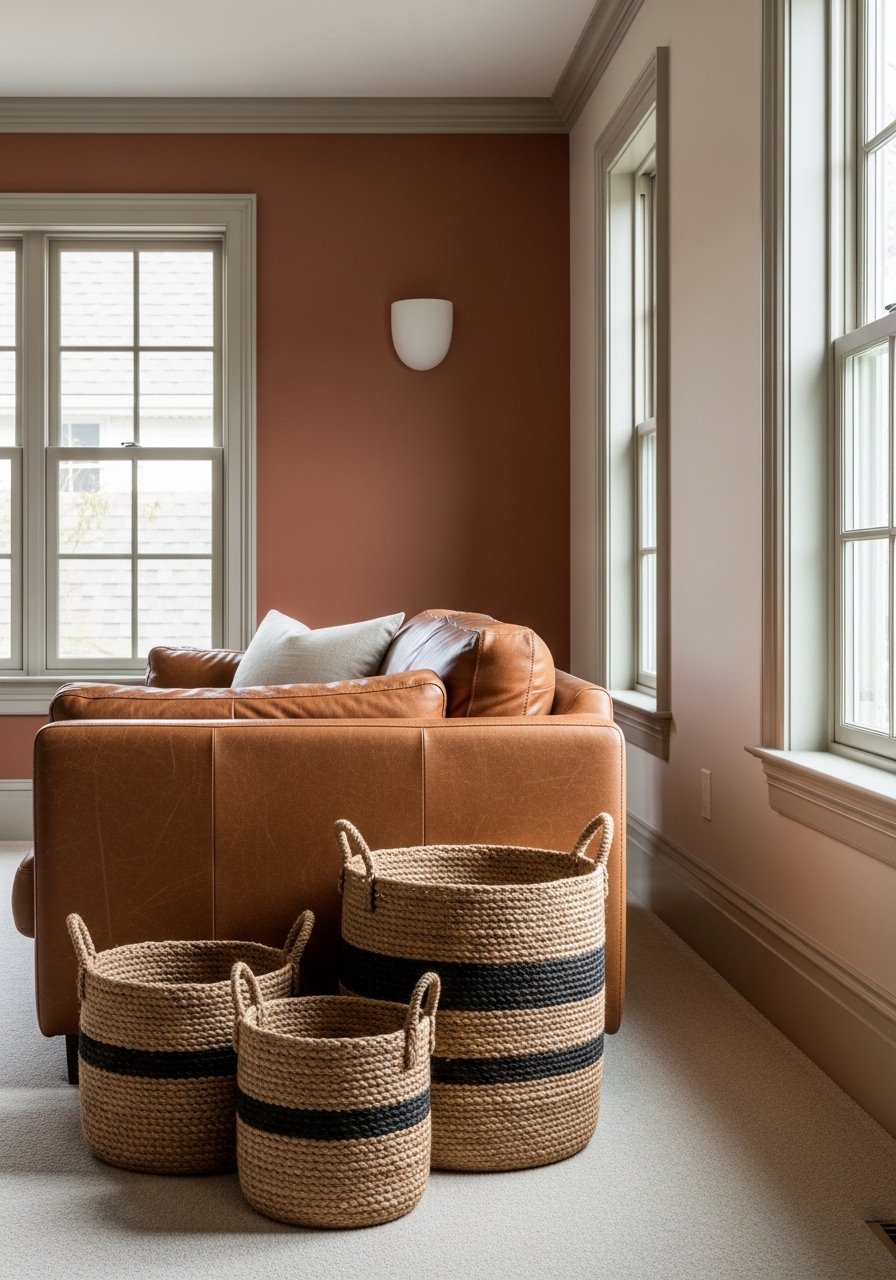
For spaces that see a lot of traffic and pets, I mixed in mushroom tones with terracotta to hide scuffs and keep warmth without saturation. Greige trim at a 1:3 ratio gives a neutral frame and the leather sofa wipes clean easily. Most people pick either full terracotta or too-cool greige and end up with a muddy result. Use an 8-pigment high-quality paint or an option known for pigment density so the color holds instead of fading. I tested a durable sample similar to high-pigment-terra-cotta-swatch before rolling it on the whole room.
Your Decor Shopping List
Textiles
- Honestly the best $40 I have spent. Velvet pillow covers, set of 4, 22-inch, mix sapphire and rust for layered contrast.
- Chunky knit throw in cream (~$35-55). Drape over an armchair for texture.
Wall Decor - Found these while looking for something else. Brass picture ledges, set of 2 (~$18-25) so you can swap art without new holes.
Lighting - For warm ambient light try brass-sconce-warm-led (~$45) to avoid harsh vanity glare.
Plants - One statement plant beats five tiny succulents. 6-foot faux fiddle leaf fig (~$80) for low maintenance height.
Budget Finds - 96-inch linen curtain panels (~$30-50 per panel) for the curtain trick in narrow rooms.
Paint Samples and Tools - Get several samples. Terracotta paint sample pack saves time and regret.
Similar items are often at Target or HomeGoods if you prefer to shop in person.
Shopping Tips
White oak beats dark wood in 2026. Design feeds have shifted completely. These white oak floating shelves look current, not dated.
Grab these velvet pillow covers for about $12 each. Swap them seasonally and the whole room feels refreshed.
Curtains should puddle or kiss the floor, never hang halfway up. These 96-inch panels are the right call for 9-foot ceilings.
Everyone buys five small succulents. One single 6-foot faux fiddle leaf fig has ten times the visual impact.
Choose high-pigment paints for longevity. Try a multi-pigment tester like high-pigment-paint-sample so it won’t fade after a month.
Frequently Asked Questions
Q: Can terracotta make a room feel smaller?
A: Yes, if you pick a very saturated deep orange for a tiny space. For small rooms under 150 square feet choose lighter peach or blush terracotta. The 30 percent pastel versus 70 percent terracotta trick opens the room. Test samples on different walls at different times of day.
Q: My terracotta looked orange in my light. How do I fix that?
A: Try a different undertone. Some terracottas lean coral or pinky-brown. Paint three samples on the same wall and observe them in morning and evening. Most folks go for terracotta vibes when they want cozy without trying hard, so testing saves regret.
Q: I rent and cannot paint. How can I get this look?
A: Use large canvas art prints, peel-and-stick wallpaper, or a floor-to-ceiling textile hung with a tension rod. A big framed print leaning against the wall reads like a painted wall without commitment. Living room terracotta paints are flying off shelves this year, but renters can still get the effect without rollers.
Q: Do terracotta walls work with pets?
A: Yes and no. Terracotta hides some pet fur but shows dust and paw prints on lower walls. Use wipeable trims, leather seating, and washable textiles. A jute rug underlay helps with wear. Nearly half fix blah rooms with warm terracottas, but consider pets when choosing finish.
Q: What paint should I pick to avoid fading or muddiness?
A: Pick a high-pigment formula, ideally an option marketed with extra pigment or an 8-pigment blend. Test a sample and track it over a few weeks. Cheap paints can wash out or go muddy once they cure.
Q: How do I mix metals with terracotta?
A: Mix them. Use brass for warmth, matte black for contrast, and add a touch of brushed nickel if you need to match fixtures. Start with one dominant metal and add the others in small quantities so it reads intentional.
Q: Which jewel tones pair best with terracotta for a living room?
A: Sapphire blue, teal, and emerald green are reliable pairs. Use a 60/40 formula where terracotta covers the majority of walls or large surfaces and jewel tones appear in large accents like sofas or rugs.
Q: Should I always test samples in north or south light?
A: Yes. North-facing rooms need lighter terracotta to avoid looking flat, while south-facing rooms can handle richer shades. Paint samples and observe through a full day before committing.