
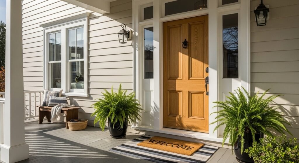
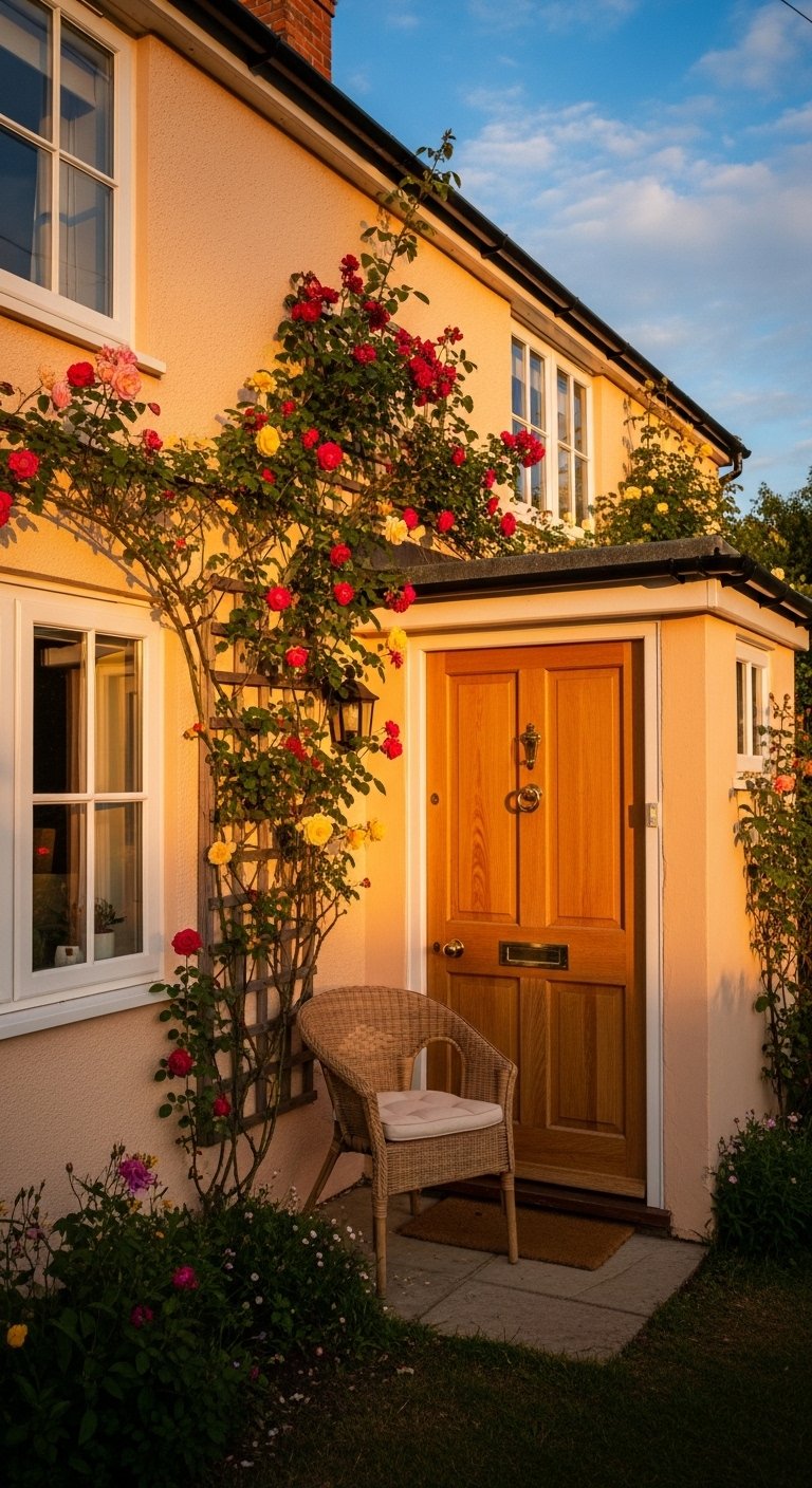
My living room had nice furniture and decent lighting but it still felt like a waiting room. Took me embarrassingly long to figure out it was missing texture. Every surface was smooth, every color was flat, and nothing invited you to actually sit down. I fixed the same feeling on our exterior by treating the porch like a room. Small swaps to trim, an accent door, and one unexpected color changed how the house greeted guests.
These ideas lean toward historic and cottage vibes with some coastal and farmhouse twists. Most projects here run $100 to $600 for paint and a few accents, with one or two splurges around $800 if you swap windows or shutters. These palettes work for porches, facades, dormers, and entryways.
Navy Body With Olive Trim For Victorian Porches
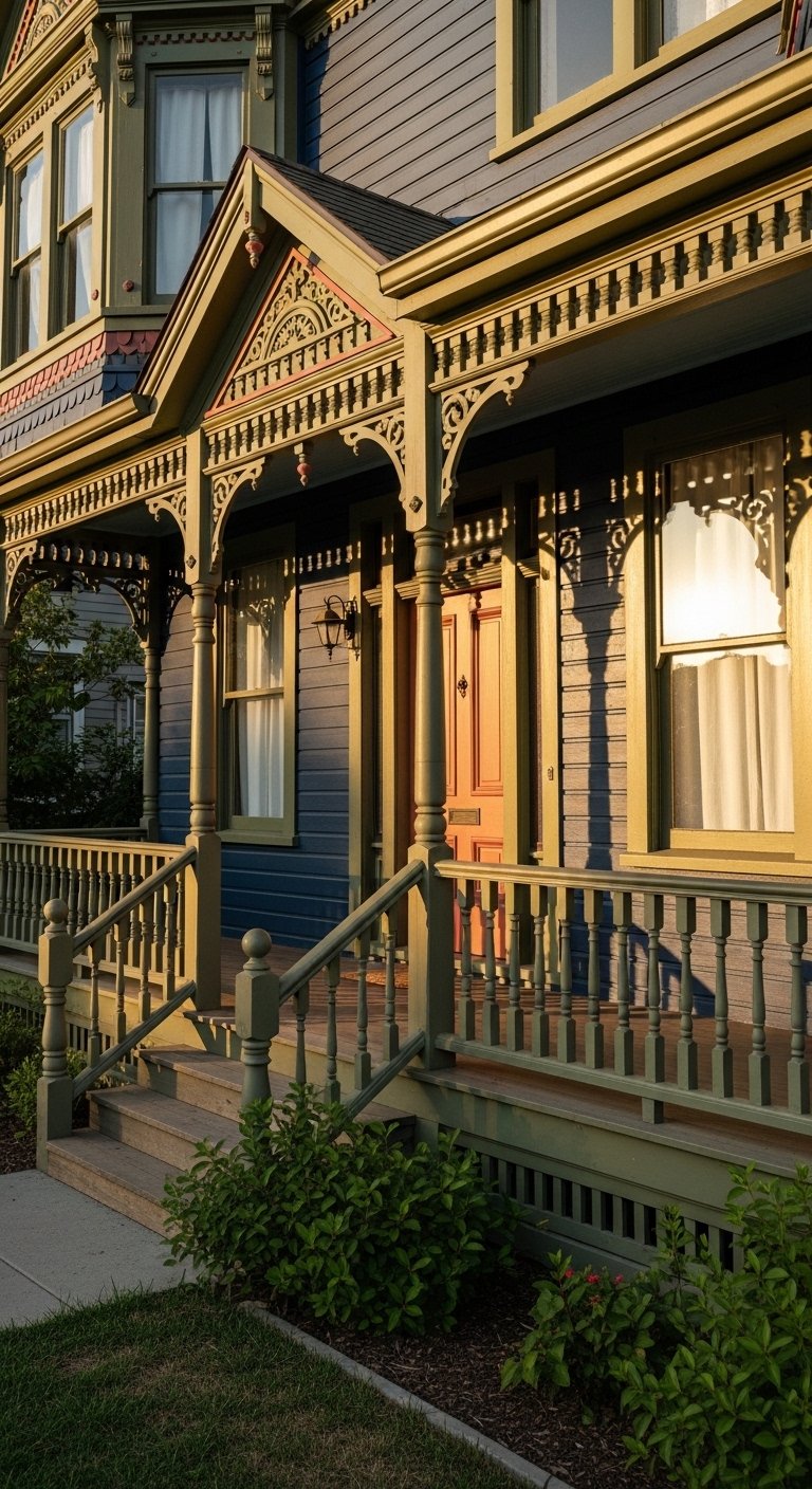
The deep navy body gives ornamented Victorian trim something to play off. Olive on the brackets and window surrounds makes the detailed woodwork visible from the street. I used a salmon front door for the small pop that doesn’t fade like bright yellow. Budget was around $300 for paint, plus $75 for a new porch mat. For paint supplies, grab a set of 15-piece exterior paint brushes to cut in around the trim. Common mistake is matching trim to the body too closely. Keep trim clearly lighter or you lose the carvings. Most folks grab from SW historic collections when going authentic.
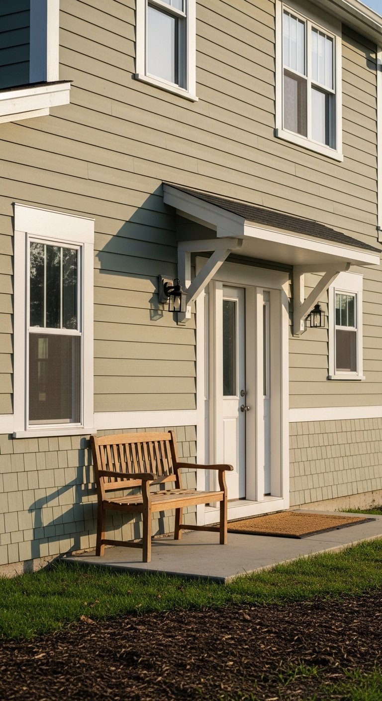
Classic White Body With Bold Trim For Craftsman Entrances
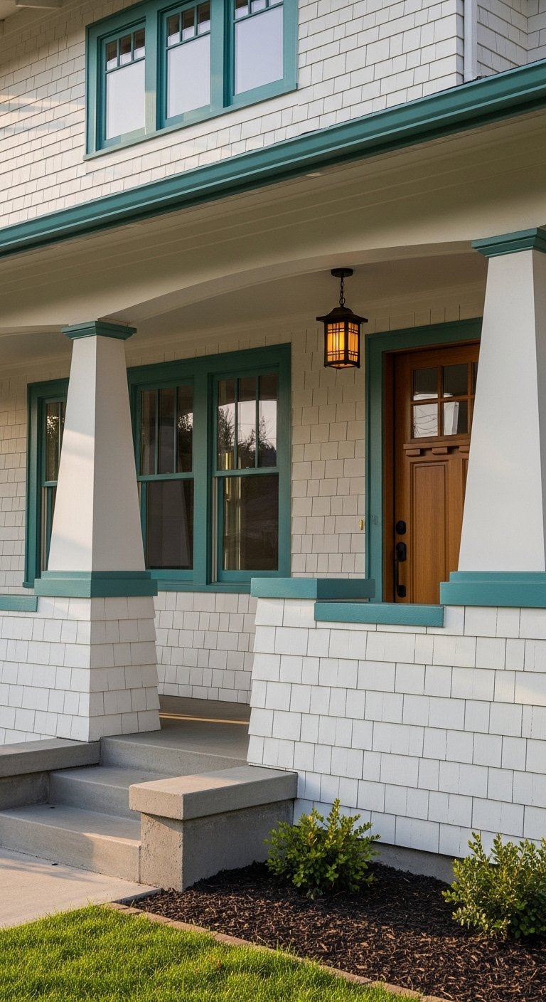
White bodies are a safe canvas and they make bold trims pop without overwhelming. For Craftsman porches I like teal or deep blue on trim and a darker tone on the door. White trim rules about eight out of ten vintage houses. Buying a matte exterior paint and using weatherproof house numbers in aged brass finished the look for under $60. The mistake I see most is painting all woodwork the same color as the porch floor. Keep contrast so columns read as architecture, not a single block.
Brick Façade With Off-White Trim For Traditional Entrances
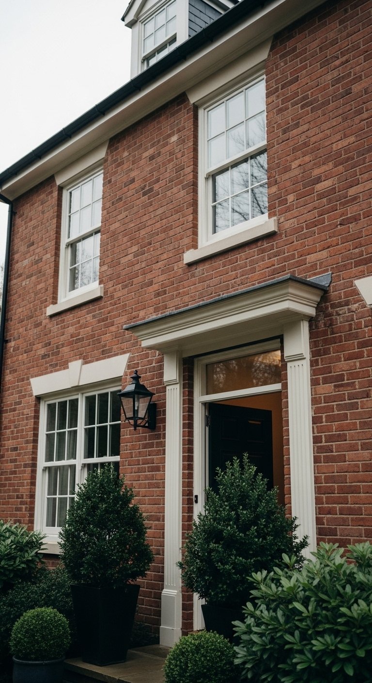
Don’t match the trim to the brick. I learned that the hard way when our trim blended and the brick looked flat. Pick an off-white for trim to give brick texture room to breathe. Add a black or oil-rubbed bronze lantern and use outdoor-grade metal house numbers to anchor the entry. A common issue is trying to repaint brick to a single color. If you keep brick natural, trim contrast is what saves the facade. For painted brick, choose a subtle off-white for windows and cornices.
Muted Sage Body For Farmhouse Facades
Muted sage reads like an updated classic farmhouse and works well on wide clapboard. Keep trim in Dover White or similar and add a natural wood door for warmth. Clapboard scale matters. Use boards that read 5 to 6 inches, not oversized planks, to keep that period proportion. I swapped our mismatched shutters for simple louvered ones and used exterior-grade wood stain for the door. The rookie move is choosing too-saturated greens that look trendy for a month and then dated. Stick to muted, less saturated shades.
Deep Teal With Cream Trim For Coastal Cottages
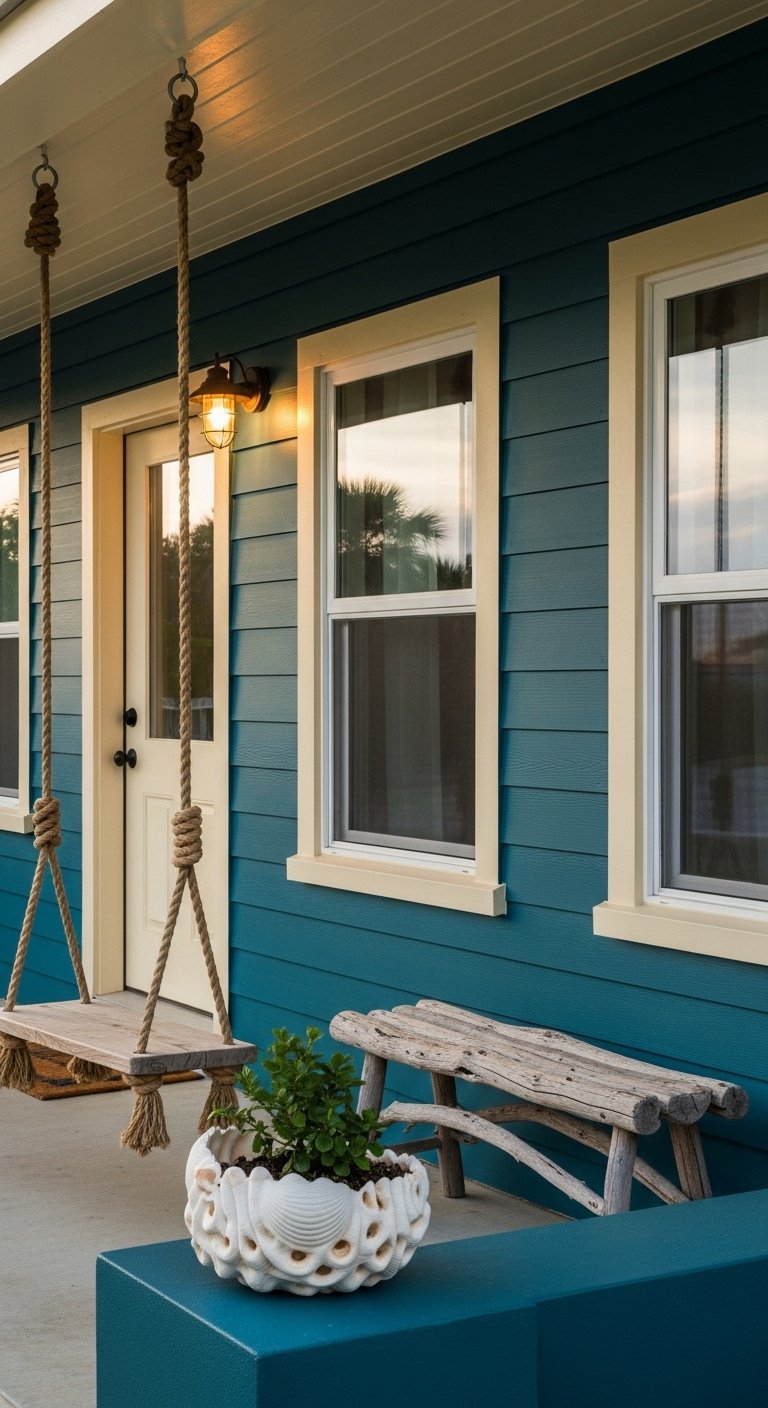
Deep teal reads clean near water and resists looking weathered. Cream trim keeps the whole composition sunny without being stark. For porch hardware consider a bronze door knocker to tie in warm accents. The real trick is matching the roof tone first. If your shingles are cool gray, favor cooler teals. A common complaint is bold accents fading fast. I avoid ultra-bright yellows and use deeper, sun-friendly accents like salmon or terracotta.
Charcoal Body With Light Gray Trim For Period Bungalows
Charcoal can make small details feel dramatic instead of heavy when paired with a soft gray trim. This combo is forgiving for modern roof replacements. Check roof undertones before choosing the trim so dormers do not disappear into the roofline. I added a rust-proof mailbox and a simple black porch light for a modest upgrade under $150. Avoid painting trim the same dark shade as the body. That flattens the facade and hides period details.
Honey Taupe With Olive Accents For Rustic Homes
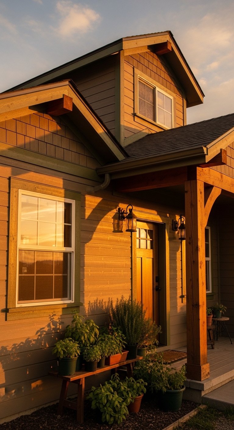
Honey taupe warms up natural wood and stone without feeling saccharine. Olive as an accent on shutters and brackets brings depth and reads like an intentional historic choice. I used a set of cedar planters to add texture at the entry. One detail most articles skip is pairing the door hardware finish to the body undertone. Match oil-rubbed bronze hardware to warmer taupes for cohesion. The usual mistake is choosing trim too bright against warm bodies. Keep accents muted.
Swap Mustard For Salmon On Sun-Soaked Porches
If you love yellow but your porch gets full sun, go salmon instead. I used to paint accents a sunny mustard and watched them bleach within a year. Salmon holds color much better in full exposure. For cushions and textiles pick UV-resistant fabrics and consider outdoor seat cushions with fade-resistant covers. The detail many miss is testing a small painted patch on the south-facing wall for a few months. That small test prevented three wasted gallons for me.
Pale Blue Body With Navy Trim For Beachside Porches
Pale blue is airy but it can read washed out. Giving it a navy trim frames windows and porch posts so nothing drifts visually into the sky. For a cohesive look pick navy for shutters and choose a marine-grade welcome mat that can handle sand. A mistake is ignoring salt air when choosing metal hardware. Opt for stainless finishes. The small detail I focus on is painting the porch floor one shade darker than the body to ground the house.
Brick Red Body With Forest Green Trim For Colonial Entrances
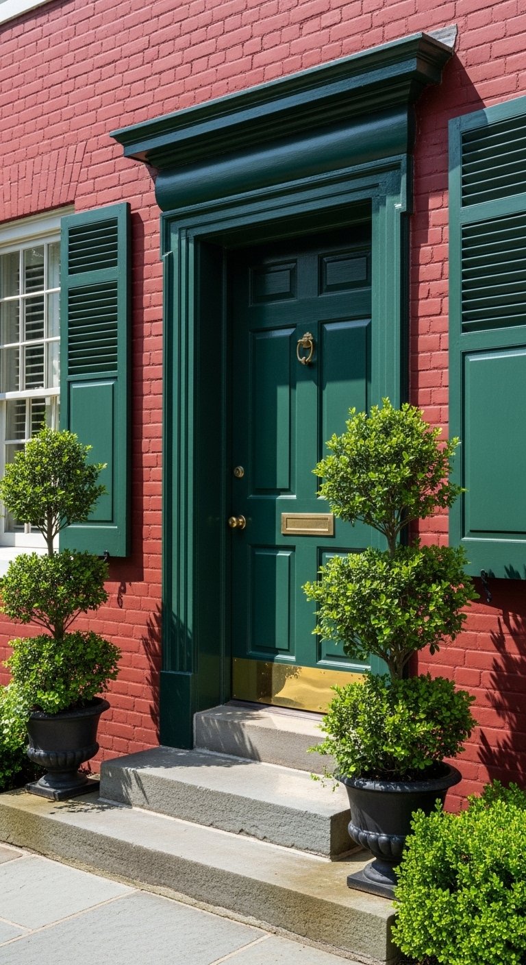
Deep brick red with forest green trim reads classic and rooted. Keep window sills and cornices in an off-white so the green reads like detail, not a blob. I added a heavy-duty front door sweep and a braided rope doormat to complete the entry. A common issue is overmatching green to existing moss tones. Choose a slightly bluer forest green if your landscaping is olive and yellow. Trim should never match the brick exactly.
Stone Gray Body With Black Trim For Urban Vintage Townhouses
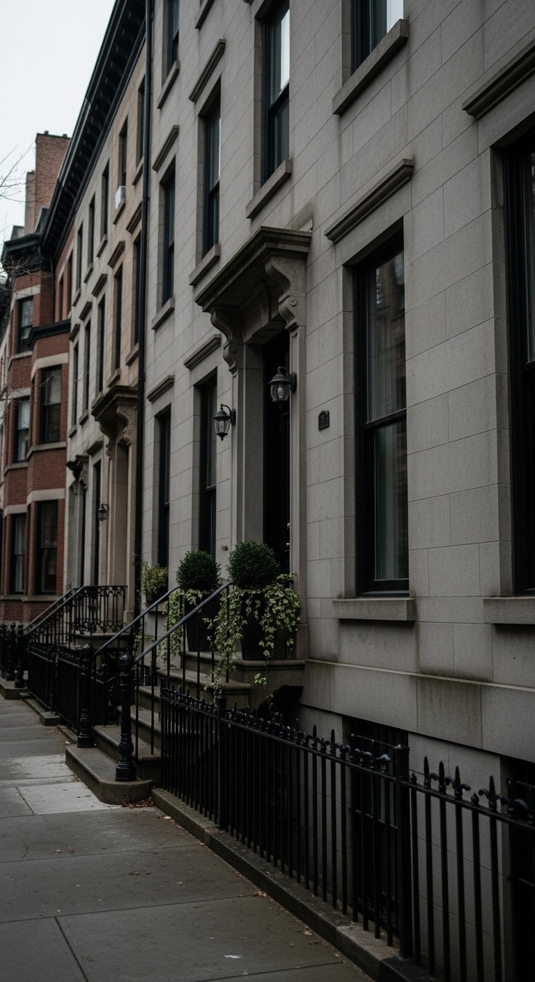
Stone gray with black trim reads sophisticated without trying too hard. Black is dramatic on window casings and ironwork. I swapped our porch light to a matte black sconce with frosted glass and it instantly tied the trim and railings together. Watch contrast on the roof so dormers remain distinct. The extra detail is painting the soffit a shade lighter than the body rather than pure white, which makes the roofline look intentional.
Soft Peach Body With Bright White Trim For Cottage Gardens
Soft peach is friendly at street level and reads especially well with bright white trim around windows and doors. Pair with warm brass hardware and a wooden door for a lived-in look. A small trick I use is adding a narrow band of a slightly darker peach at the foundation, roughly 4 inches high, to ground the facade. Pick a durable exterior brass finish and consider polished brass house numbers that patinate nicely. The mistake would be adding too many competing accents that fight the warmth.
Two-Tone Split For Second-Story And First-Floor Contrast
Splitting body colors by floor adds visual weight where you need it. I painted our first story a warm cream and the second a soft slate blue. The key is keeping a single trim color for continuity. Use a 60/40 ratio with the darker color on the smaller plane so the home reads grounded. I used exterior painter’s tape wide roll to get that crisp line. The usual error is switching trim for each level and creating a patchwork look.
Monochrome Vintage Grays With Copper Accents For Roof Details
A monochrome gray body with varied gray trim tones can be interesting if you add one warm accent like copper on gutters or the mailbox. Copper reads intentional and ties to vintage metalwork. Roof color dictates a lot here. If you have cool-toned shingles, keep grays leaning cool. I installed a small copper mailbox and the entry felt like it had always been that way. A common oversight is low contrast on the trim, which makes dormers disappear into the roof.
Three-Color Depth With White Trim Base For Historic Revivals
I love this rule: body, trim, and one or two accents. Trim should be a clean off-white so accent colors can shine. Use a pop on the door and smaller details like brackets or window boxes. I spent $250 on paint and $120 on new hardware to complete the look. Pick Benjamin Moore White Dove or similar for trim. For swapping accents seasonally try magnetic shutter covers to test colors without committing. The mistake people make is adding a fourth color and losing cohesion.
Slate Blue Body With Cream Trim For Dormer-Focused Facades
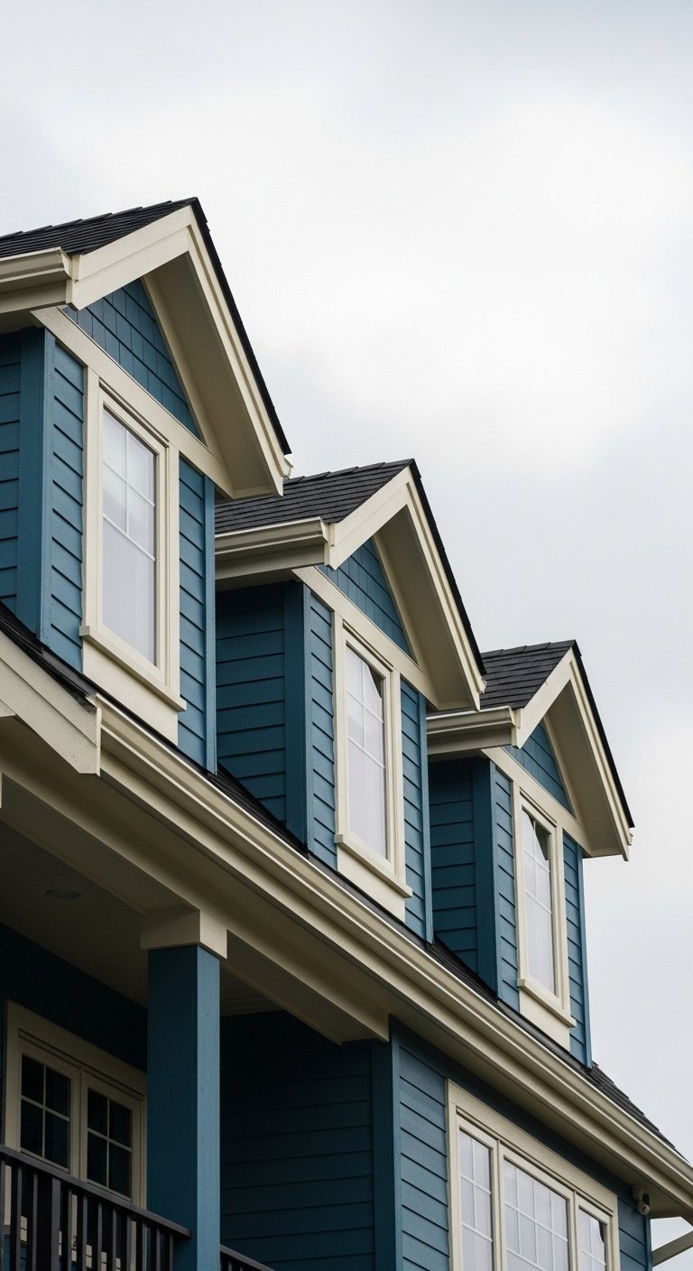
If dormers are the house’s best detail, paint them cream and lean the body slate. That keeps dormers crisp against a darker backdrop. Match the dormer trim tone to window casings not the roof. A detail many miss is that roof replacement can change how dormers read. Before painting, tape a 2×2 foot sample near each dormer and check it at different times of day. For roof-compatible fasteners, pick corrosion-resistant roofing nails when you replace hardware.
Your Decor Shopping List
Textiles
- Honestly the best $40 I have spent. Outdoor seat cushions, Sunbrella-style fabric in neutral stripes, 24 x 24 inches.
- Chunky knit throw blanket in cream (~$35). Great draped on a porch bench.
Lighting & Hardware
- Matte black outdoor sconce with frosted glass (~$60).
- Polished brass house numbers for a warm accent.
Planters & Greenery
- Cedar wood planters, set of 2 for flanking entries.
- Artificial fiddle leaf fig 6ft when real plants won’t survive.
Paint Prep & Tools
Budget Finds
- Weatherproof house numbers metal (~$25).
- Marine-grade welcome mat (~$30).
Shopping Tips
Bold finishes last if you pick the right material. Polished-brass house numbers patina nicely outdoors.
Grab 96-inch linen-like curtain panels for porch sun protection and scale.
Curtains should puddle or kiss the floor, never hang halfway up. Outdoor seat cushions in UV-resistant fabric keep color fresh.
One tall plant does more than five small ones. Try an artificial fiddle leaf fig 6ft where height is needed.
If you are testing a bold accent, use magnetic shutter covers to try a color without committing.
Frequently Asked Questions
Q: How do I pick a trim color if my house has brick and painted siding?
A: Keep trim off-white and avoid matching it to the brick. Off-white adds breathing room. Use a small sample patch and view it at different times of day.
Q: My accent colors faded quickly last summer. What should I do?
A: Swap bright yellows for deeper salmon or terracotta shades and choose UV-resistant finishes. Also test a small area first for a season.
Q: Can I mix modern metal finishes with vintage exterior paint?
A: Yes, mixing metals looks deliberate. Match one finish to larger elements like lights and use another for small hardware. Mixed metal frames and hardware can inspire combinations.
Q: What siding width looks most vintage?
A: Use clapboard around 5 to 6 inches to keep period proportions. Oversized planks read modern and change the whole look.
Q: My dormer seems to disappear into the roof. How do I fix that?
A: Match the dormer trim tone to the roof undertone and keep a slightly lighter trim so the dormer reads separately. Tape a sample nearby and check at different times.
Q: I live in a rental. How can I test an exterior vibe without permanent changes?
A: Use magnetic shutter covers, removable house numbers, and potted planters. Try temporary accent rugs and cushions to see what you like.
Q: Should my roof dictate the palette?
A: Yes, roof color should guide your choices so features like dormers and trim do not vanish. Pick cool palettes for cool roofs and warmer palettes for warm roofs.
Q: How many colors is too many for a vintage exterior?
A: Stick to three colors maximum: body, trim, and an accent. That gives depth without chaos.